GFO’s Infographics: Teacher Salaries and the Cost of Living around the Country
 One of the resources offered by Get the Facts Out (GFO) is the “A Teacher’s Life by the Numbers” (TLN) infographics. GFO’s Research Team creates infographics with useful information for undergraduate students – and the faculty who advise them (formally or informally) – about the regular salaries of local K-12 teachers at various points in their careers, as well as various measures of the costs of living in the same region. Students can then compare a teacher’s salary with that of other careers they might know about (or are thinking about). The Research Team collects data from all around the U.S., creates the infographics, and then adds them to the Teacher Salary Data map on the GFO website where they are available for free download. The goal is to give a basic picture of what the starting and mid-career points would look like for anyone pursuing a teaching career.
What is a TLN Infographic?
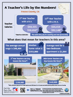
This one-page document provides a quick, visual representation of teachers’ lives at different career points in various counties throughout the nation. For each county or group of adjacent counties, it displays:
- how much teachers make in their first year versus mid-career,
- how their salaries compare to the average annual wage in their area,
- how much housing costs in their area, and
- the types of houses first year and mid-career teachers can buy.
The TLN infographics provide this information in a clear and easy-to-read format. This allows for students and faculty members to quickly see how teachers’ salaries in surrounding districts compare to the local economic picture in their county.
The same salary data is also used to create a PowerPoint slide for showing to students and others. (See the end of this article.)
How is a TLN made?
Collecting Teacher Salary Data
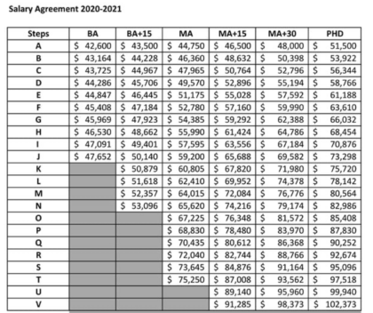
Early on in the GFO project when the Research Team decided to start collecting data on teacher salaries, the first thing that was learned was that it was quite challenging to figure out exactly what salaries teachers make. For most districts, there is a salary schedule of base pay that has rows and columns which correspond, sometimes only loosely, to a teacher’s number of years of service along with degrees and/or graduate- and continuing-education credits earned. What’s more, there are often numerous additions and supplements to the listed salary for things like longevity within the same district, National Board teaching certification, positive performance evaluations, teaching a high-needs subject like math or science, extra-duty pay (for coaching, advising student clubs, serving on school or district committees), and a number of other factors.
To be able to collect teacher salary data at this level of detail, the Research Team realized districts would have to be researched one at a time. They would find a salary schedule by reading through the teachers’ contract used in that district. These contracts or salary tables can usually be found on each district’s website, but sometimes a call or email to the district’s Human Resources office is necessary. Once all the information is located, the team uses it to estimate what a teacher would likely make at each of these four points in their career:
t A sample district salary schedule
Categories of experience and degree type used for the TLN materials
BA 1 A beginning teacher with a Bachelor’s degree and no experience
BA 5 A teacher with five years of teaching experience and a Bachelor’s or Master’s degree plus additional credits
MA 15 A mid-career teacher with 15 years of teaching experience and a Master’s degree plus additional credits
MA 30 An end-of-career teacher with 30-35 years of teaching experience and a Master’s degree plus additional credits

The Research Team uses the contract language for each district to determine where these career points would likely be placed on the salary schedule. Any supplements or extra steps to the base salary that would likely apply to all or most of the teachers at those career points are also added in as described by the current contract.
The team also makes these additions to each salary estimate, when they are present in the contract:
- longevity supplement
- district or state supplements for all STEM teachers
Salary modifications that are currently NOT added to the numbers on each infographic include:
- National Board certification supplement,
- supplements for performance evaluations,
- any step jumps or placements that were not available to all STEM teachers, and
- extra-duty pay. However, we intend to include information on extra-duty pay in future versions of the infographic, since more than half of all teachers participate in some sort of extra duties.
The team also collects teachers’ health insurance premiums from the district’s website or teacher contract, if available. This is also intend to be included in future versions of the infographic. This has been found to be yet another great benefit that teachers have because many school districts pay a great deal of the monthly premium for their teachers!
The Research Team has collected this data from over 200 districts for the 2019-20 academic year, over 300 districts for 2020-21, and over 250 districts (so far) for 2021-22. These districts are from all over the U.S. and represent large, medium, and small districts as well as the four district locale types identified by the National Center for Education Statistics (rural, town, suburb, city).
How and Why We Collect County-level Data
 After the Research Team collects data on teachers in a given school district, they gather data about the county/counties where the district resides. These data include the average annual wage for all occupations, median home value, and average rent for a 2 bedroom rental for the county where the district is located, all from public sources identified below. If multiple counties are used to make up one infographic, each of these values is averaged.
A lot of time and effort went into determining reliable and accurate data sources for each item, especially average wages, fair market rents, and housing prices. The Research Team worked with an economist and a real estate agent at several different points throughout the process. Teacher salaries are typically determined at the school district level; however, each state has its own unique system for determining district boundaries. While there are a few cases where district boundaries are aligned with the county boundaries, it is the exception. It was not obvious at first that it would make sense to make a separate infographic for each county. However, the economist consultant helped the Research Team find both the BLS wage information and the HUD rental rates and explained how the data in these resources are grouped by county. Median home values for each county were taken from Zillow.com. It became clear that we needed to make a separate infographic for each county, for the sake of consistency.
| Sources of county data for GFO infographics | |
|---|---|
| Average annual wage | U.S. Bureau of Labor Statistics (BLS) |
| Median home value | Zillow.com |
| Average rent for a 2-bedroom home | RentData.org, which uses Federal data |
Average Annual Wage
The Research Team uses county-level data from the Quarterly Census of Employment and Wages from the U.S. Bureau of Labor Statistics. This spreadsheet is updated twice per year, about 6-9 months after each reporting period. The average annual wage is found by multiplying the average weekly wage of the “total covered” value for that county by 52. This is an important visual value for the infographic because it allows prospective teachers to see how teacher’s salaries compare to that of the average annual wage in their county.
Median Home Value
The Research Team finds the median home value of the county that the school district is in by using the Zillow Home Values site. The Zillow Home Value Index number has a big impact on the infographic because a prospective teacher can compare the types of houses that teachers can buy to the median home value in that county. Quite often, we’ve found, the median home value in a county is affordable for a first-year teacher in the same location. The team’s process for finding appropriate houses to display is described below (“Merging data onto the TLN infographic”).
Average Rent
Rent data is found on RentData.org. This site uses the current Fair Market Rents (40th-percentile rents) as determined by the U.S. Department of Housing and Urban Development (HUD). The Research Team uses this site because they have organized the information in a very user-friendly way. Before deciding to use it, we cross-checked a range of locations to verify that their data was up to date and matched HUD’s website. The rent data value is found by selecting the state that the school district is in from the dropdown menu and finding the values for a 2 bedroom rental in the school district’s county.
Homes a teacher can buy
This last part of the data collection process is the most  visually rewarding because you get to discover the beautiful homes teachers can buy. We use Zillow to find houses in the county we are researching that teachers could afford in their first year of teaching and in their 15th year (“mid-career”). If only one county is represented, then we use the search bar in Zillow. If more than one county is used, we draw a custom boundary so we can search for houses in each of the counties represented on the Infographic.
To determine what home values are affordable for teachers, we start with 36% of the teacher’s base annual pay and divide by 12 to get a monthly contribution amount. We then use Zillow’s “monthly cost” section (available once you select a specific house) to estimate the monthly cost for several houses purchased with a 5% and 20% down payment. When the monthly estimate for a house matches the teacher’s monthly contribution, we consider that house “affordable” for the teacher. (We use the 5% down payment estimates for first-year teachers and the 20% for mid-career teachers.)
Once this is done, we search for equivalent homes that have been recently sold in that county and insert their pictures and purchase price on the infographic.
Making Teacher Salary Data slides
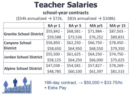
The teacher salary slides that are paired with the TLN infographics list the key districts in the region and the range of standard salaries at different points in a teacher’s career for each of those districts. These salary ranges are divided by the same categories of experience and degree type that we use for the infographics (see table above).

Sample of a teacher salary slide provided along with infographics
Most of these salary tables made by the Research Team display a range of values in each column because salaries often vary not only by experience/degree category, but also by the number of additional course credits the teacher has beyond their completed degree. Some districts even require teachers to have (or later get) additional credits.
The upper limit of each salary range represents teachers who have a large number of extra credits and who may have started at an additional step on the salary schedule (i.e., at a higher salary). Many districts incentivize hard-to-fill positions, such as science and math teachers, by starting them on a higher salary step for their experience/degree level. There is good evidence for this in this video and this article.
Additionally, some STEM graduate students leave their programs early and become teachers; these students often have significant coursework beyond their Bachelor’s degree and thus can earn a larger starting salary in many districts.
How can you use a TLN infographic?
If you see a pin on your location on the Teacher Salary Data map, you can click on it to find options for downloading that location’s infographic (in PDF or PowerPoint formats) and/or the Teacher Salary Data PowerPoint slide. We recommend editing the PowerPoint files by adding information about your teacher-preparation program and sharing them with prospective teachers and with colleagues who may not know how much a teacher can make in their area. The Research Team hopes these will help with your efforts to improve STEM teacher recruitment.


