How GFO Collects Perceptions Data Nationwide
To help understand common perceptions of teaching and how those perceptions impact students’ desires to become teachers, we use two versions of a survey called Perceptions of Teaching as a Profession (PTaP for students, and PTaP.HE for Higher Education personnel). We have used these surveys at over fifty colleges and universities nationwide. As one might imagine, collecting this data is a challenging endeavor, but starting with best practices in the field and some trial and error, we’ve developed a methodical process that has yielded fruitful data for our project.
The collection process
The PTaP and PTaP.HE surveys are distributed to our 50+ Study Sites on an annual basis with the goal of collecting responses from at least 75% of the targeted students and faculty. We recommend to each site’s leaders (the faculty members who agreed to distribute the surveys) that they survey an intro-level course of majors as well as an upper-level course, in order to collect evidence of perception changes caused by faculty efforts to share the facts. For example, a Study Site could target physics majors by surveying an introductory calculus-based physics course and an upper-level mechanic’s course.
For the PTaP.HE, we ask site leaders to gather responses from all of the faculty in the same departments for which PTaP data was collected from students. Email invitations seem to net fewer participants than personal requests or time devoted during a department meeting.
We communicate individually with the leaders at each site on a semi-regular basis, which is part of how we maintain relationships with them beyond just our annual request for data. Each year, we reach out to site leaders with an overview of the upcoming data collection and to schedule their collection period.
 Once we provide the survey links, the site leaders distribute the surveys to the students and faculty at their institutions. To minimize the efforts required from those collecting data, we provide email templates for site leaders to use for distributing the survey links. A typical data collection period lasts 1-2 weeks, and the responses come directly to the GFO research team, not the site leaders. We give them periodic updates on response numbers during their collection period, and when it ends, we provide a final count of both student and faculty responses. Upon request, we also provide a list of students’ names for extra-credit purposes (we have IRB approval to share these, as extra credit is a useful tool for encouraging participation).
One other request we make of Study Sites is to tell us the numbers of students and faculty whom they asked to take the surveys: combined with the response numbers, this tells us the participation rate, which is helpful for the data analysis.
Participation rates vary widely, from a few percent to a large majority. It is clear that offering the survey – in connection with extra course credit – increases participation rates substantially over general invitations. Collecting close to a 75% response rate is critical to making inferences about the data. Lower rates leave open the real possibility of selection bias. There also seem to be some subtleties such as evidence that first-year students care more about extra credit than juniors or seniors.
Why every year?
One of the expectations of our Study Sites is that they share resources with their students and fellow faculty each year to get the facts out about teaching as a profession. We measure perceptions every year to determine the extent to which these presentations and the use of other GFO resources affect the perceptions at each site. Faculty and upper-level students who have been exposed to the Busting Myths About the Teaching Profession presentation and other resources are more likely to show a positive change in their perceptions of teaching. Data collected from intro-level students can also serve as a sort of control group each year.
The extent to which GFO resources are used varies from site to site, so both instruments are appended with a questionnaire about resource use (for faculty) and resource experience (for students).
What do we do with the data?
This data is critical for the Get the Facts Out project to meet its goals and is used to answer the majority of our research questions. Specifically, it allows us to better understand perceptions and how they can be improved via informational campaign efforts by faculty. It also helps us understand which resources are most effective in these campaigns. Additionally, one of the return benefits to Study Sites is a customized report each year with their institution’s results.
Every year we analyze both the PTaP and PTaP.HE data from each site and create individualized reports that we send to site leaders. These reports include results for each survey broken down into empirical categories such as “Personal enjoyment” and “Salary accuracy.” We use radar plots to illustrate perceptions – at many institutions, for example, students’ understanding of teachers’ salaries and other compensation is poor, indicating that they aren’t aware of the facts about teacher benefits.
We also compare the perceptions at each institution to a national benchmark in each category to show in what ways students and faculty have a better or worse understanding of teachers and teaching than their counterparts at other institutions. Below is an example of a radar plot summarizing PTaP results for one institution.
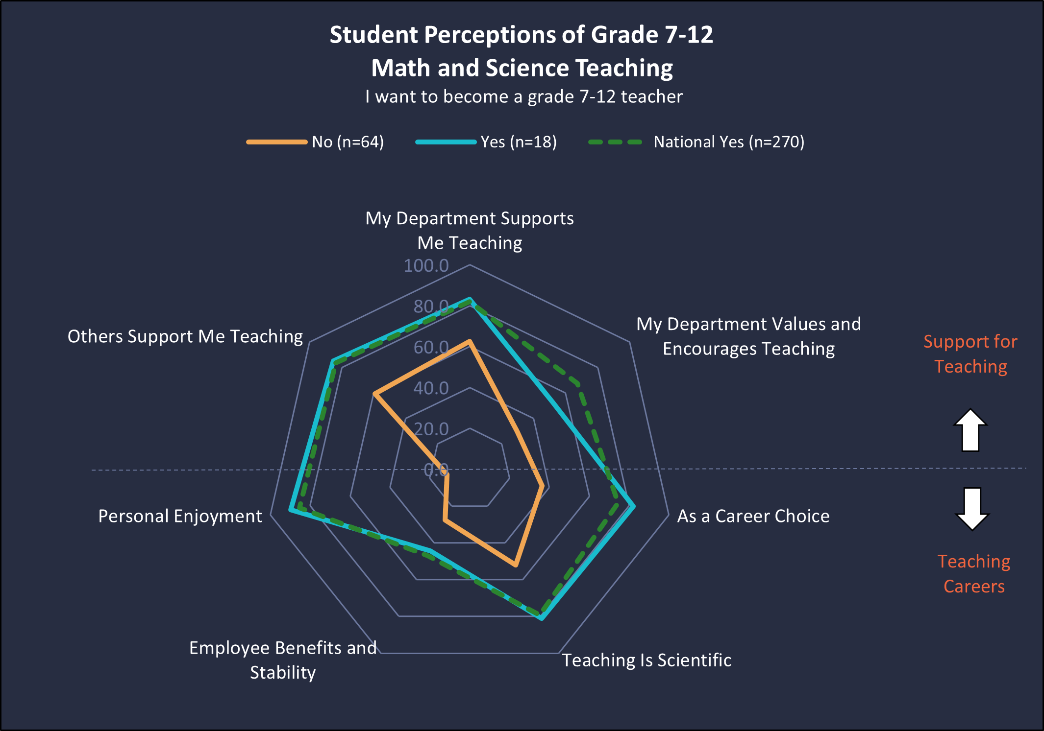
Student perceptions of grade 7-12 teaching at one university as measured with the Perceptions of Teaching as a Profession (PTaP) instrument, disaggregated by whether the students agreed (n=18) or disagreed (n=64) with the statement “I want to become a grade 7-12 teacher.”
Additionally, we use the data we receive to examine student interest in teaching across the country as well as in which categories perceptions are generally lacking or more negative across the country, and we create resources for faculty to use in their programs to help shift these perceptions toward more accuracy.
Why this matters
Our annual “data push” is a vital part of the Get the Facts Out project because it helps us understand the current perceptions of teachers among STEM students and faculty across the country. This information equips us to shift perceptions in a positive way and recruit more STEM teachers.
Teachers in the U.S. rate their lives better than all other occupation groups, trailing only physicians. By getting the facts out about teaching, we hope to encourage many of today’s budding scientists to become teachers of tomorrow’s innovators.